Why transport planners in Australia and New Zealand still run on spreadsheets – and what it's quietly costing them
Spreadsheets run a surprising amount of public transport planning across Australia and New Zealand (ANZ). Here's why it persists and what it costs planning teams.
5 min read
24 August 2026
Mosaiq by Snapper Services’ Head of UX, Richard Nichol, has spent the past six months talking to transport planners across Australia and New Zealand about how they actually work day-to-day. This blog shares some of what he found, including one thing that came up in almost every conversation: spreadsheets are still doing more heavy lifting than anyone expects.
Even when the information about their network is sitting right in front of them in a convenient dashboard, they'll still pull it into a spreadsheet to build trust.
The spreadsheet becomes their operating system, collating multiple sources of data into one static, fragile file.
It's not that the data a planner sees in transit software is wrong – it's just that it presents easy-to-understand aggregates. It's about what a planner needs for a number to become defensible. Usually, that's every row of data underlying those aggregates or averages, with the granularity to withstand any pushback from funders or authorities.
Planners rely on Excel for the proof behind their Key Performance Indicators (KPIs)
Based on our research into public transport planners' daily workflows, there's a gap between the system that surfaces an insight and the process someone goes through to validate it.
Across ANZ, we see the same pattern: a dashboard in a transit intelligence platform can show a planner exactly where a route is underperforming. But showing isn't the same as proving.
For planners, proving usually means getting the underlying data into a spreadsheet, re-cutting it, and checking it against a contractual definition. Then they build an argument they can confidently put forward – whether that's for network improvements or penalty relief.
This gap – where planners work in spreadsheets – is worth taking seriously: planners lose time between high-level insight and network outcome as they manually build databases in Excel and Power BI.
It also explains why Mosaiq by Snapper Services' simple export feature is widely used across Australia.
Excel is still a key tool for transport planning across ANZ: what our data shows
We pulled six months of data (1 January – 30 June 2026) on how people across ANZ use export functionality in Mosaiq Insights, our transit intelligence platform.
In that time, there were 3,272 export events, triggered by 73 unique users. That works out to around 545 exports a month, or seven to eight exports per user, per month. That's a lot, and shows that transport planners are truly data-literate and hands-on with their numbers.
Are transport planners interested in stop details, route details, or agencies?
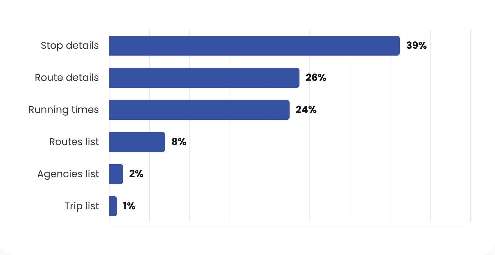
Stop details page stands well clear of the rest, accounting for 39% of all tracked exports.
Route details and Running times pages cluster together a step below Stop details. Together, these two pages make up half of all exports.
Routes list sees meaningful but much lower use (8% of all exports).
Agencies and Trip list pages are almost negligible in comparison to the other pages.
Figure 1. Exports per page, 1 January – 30 June 2026
What does this tell you about what transport planners from other operators care about?
Our research programme into the day-to-day of transport planners in ANZ arose because, in our experience, nobody knows the standard for what "good" process looks like. A flexible tool like Excel naturally starts to carry a lot of weight as different operators build their own "best practice". There are no generally accepted alternatives to Excel for transport planning, or an external benchmark to look at.
However, from our research, we've been able to provide some insight into what planners at other organisations actually care about.
Stop details is where the "I need this in Excel" moment is strongest.
Per-stop performance data is the thing transport planners most need to take out of the product and validate elsewhere.
Route details and Running times are needed in Excel but not as often.
Our research interviews suggest that the use of these pages is typically centred around timetable changes: checking schedule or performance data at a fairly granular level.
List-level pages barely get exported on their own.
People mostly export once they've drilled into specifics: they want to get hands-on with the detailed, stop-level numbers that support their umbrella KPIs.
Excel is a great starting point. It's a familiar, flexible tool that almost every planner already knows how to use. That’s exactly why so much transport planning evidence still gets built and checked there.
The limits show up as the case grows. One planner working alone can keep a spreadsheet accurate and current without much effort, but the more routes you analyse and the more colleagues get involved, the harder it is to maintain clarity.
That's when familiar friction creeps in: version conflicts, lost files, and stale data. A static tool wasn't built to carry a whole team's decision-making.
The lost time between insight and action
Once a planner has pulled a number into a spreadsheet, validated it, and built a case around it, that case still has to clear the process: getting buy-in from councillors or funding bodies, writing business cases, logging resource asks, mandatory stand-down periods, negotiations with unions, and more.
That "insight to outcome" process is slow enough that the insights can become stale before the evidence supporting them is even used. It's a bit like negotiating to buy a house. If it takes four months and the market shifts in that time, you don't get to renegotiate. You're stuck with the price you agreed to, even though it stopped reflecting reality somewhere along the way.
When it comes to improving a public transport network, any number of things can change rapidly: punctuality shifts, patronage spikes, road works driving up running times, or an operator changing hands. By the time the evidence reaches a decision maker, it may already describe a network that no longer exists.
What we’re working on to close the gap
Exporting raw data is a genuinely useful step for planners who need to run a deep dive to validate or defend a number, whether that's their aggregate punctuality, reliability, or another KPI.
Insights makes that possible with our unmatched depth of data (ingesting ~2,000% more bus GPS pings or “heartbeats” each month than our nearest competitor) and easy-to-use export function.
But our research makes it clear that there's an underlying problem with data freshness once the numbers land in Excel.
We’re working on closing this gap between insight, evidence, and outcome – so you can access both overview and aggregated evidence on–demand, in one place. You’ll be able to drive faster network improvements using one source of truth, without stale files or the spreadsheet sprawl.
Stay in the loop to be the first to know about our upcoming release, and catch the rest of our research findings by subscribing to the Mosaiq Minute.
Stay connected
Want to be the first to know about the latest Mosaiq updates? Make sure to check our Release Notes regularly. To get monthly updates direct to your inbox, sign up to our mailing list.
Catch up on the latest Mosaiq news, industry updates, and thoughts from the Snapper team.
Request a demo
Let one of our team show you how we can help improve your transit network with Mosaiq. Set up a comprehensive, personal introduction for you and your team today.