Identify which services need attention
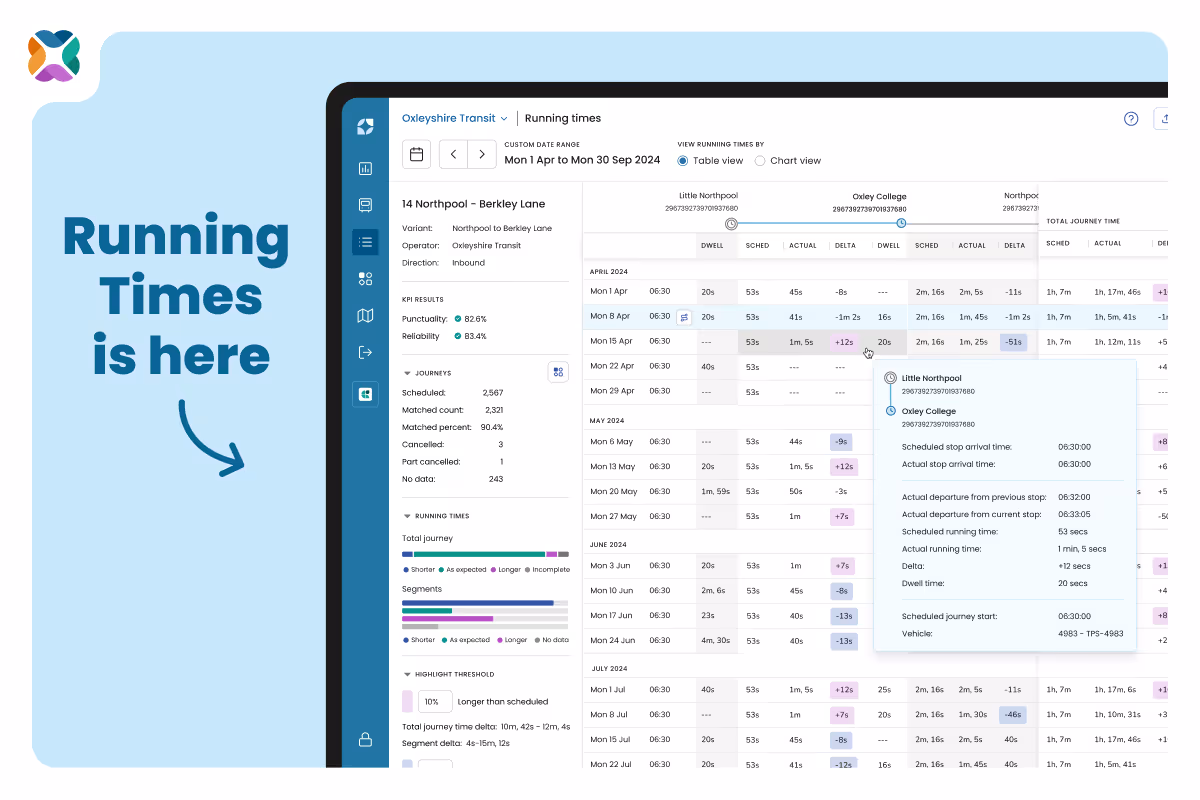
Start on the Services Page, where you'll see a clear overview of how each service is performing. You can view a summary of running times by:
- Total journey time
- Individual segments between stops
Sort by performance to see which services are consistently running more than 10% shorter or longer than scheduled. This is a great way to pinpoint where there’s surplus time that could be reallocated elsewhere.
Pro tip: Click on the “Shorter” button to instantly bring to the top of the list services with the greatest potential for optimisation.
Drill into when issues happen
Once you've identified a service that looks inefficient, go deeper on the Service Details page.
Here, you'll find:
- Direction-specific performance summaries
- KPI metrics for a broader performance snapshot
To zero in on when inefficiencies occur, like a specific time of day or day of the week, head to the Running Times page.
There, you can filter by:
- Day of the week (e.g. Mondays)
- Time of day (e.g. 6:45am)
- Stops or timing points only
Visualise patterns with Chart View
The Chart View makes it easy to spot trends and where exceptions occur enabling you to visually inspect the performance of a selected trip, compared to the average for all trips.
- Hover over the chart to get precise segment-level information for the selected trip
- The selected trip is highlighted in light blue in the list of filtered trips, alongside the chart and appears as a dark blue line within the chart
- The hot-pink line shows the average deviation (delta) from scheduled running times across all filtered trips
- Highlight thresholds are applied to the background of the chart so you can see whether your selected trip (or the average for all trips) is running shorter or longer than the scheduled duration.
This is ideal for validating whether a recurring issue exists, or whether a single outlier might be skewing your data.
Don’t know when or where the problem is? No problem
Even if you're not sure which time or day is the issue, you can still uncover insights:
- Start with the Chart View to spot abnormal lines or patterns across days and times
- Use filters to narrow the scope, switch between different time ranges and see how the average line changes
- Use the Table View to scan delta values more precisely and confirm where changes might help
Validate recommendations with evidence
If you've received running time adjustment recommendations from tools like Optibus’ Performance Suite, you can use Mosaiq to validate them with confidence.
Let’s say Optibus’ Performance Suite suggests that your 6:45am Monday service has more scheduled running time allocated than seems necessary.
In Mosaiq:
- Head to the Running Times page
- Filter to Mondays at 6:45am
- Use Chart View to see whether the data backs up the recommendation
- Confirm if any segments consistently run shorter than scheduled
You can even compare multiple trips and identify exactly where slack exists, before you make any changes to your network.
Ready to optimise your network?
With Mosaiq’s Running Times feature, discovering and addressing inefficiencies in your network is easier and more intuitive than ever. Whether you're fine-tuning existing services or planning broader improvements, our tools help you make changes based on real data, not guesswork.
Explore your services now and start getting more from your network by signing up for a quick demo or chat with one of our team.


.avif)


